What makes a good data visualization?

A good data visualization is, in its essence, one that requires little or no explanation in order to understand.  I’ve made this Venn diagram as part of my (proposed) TED talk to help you understand.
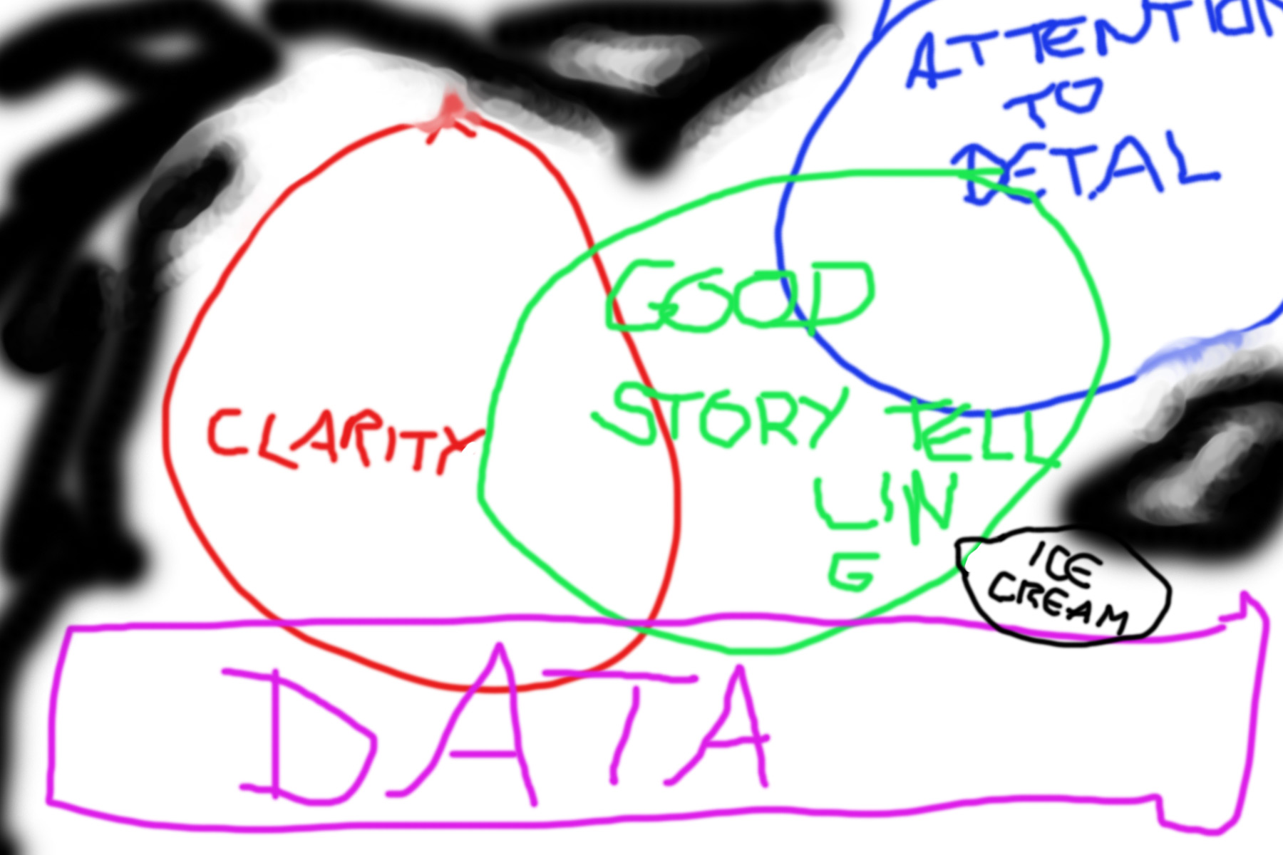
Good-viz-ice-cream

(Fig. 1)

Please let me know if you have any questions, or if you are in any way associated with the TED scheduling department.

Advertisement

Leave a Reply

Please log in using one of these methods to post your comment:

WordPress.com Logo

You are commenting using your WordPress.com account. Log Out /  Change )

Facebook photo

You are commenting using your Facebook account. Log Out /  Change )

Connecting to %s